
Digit + Oportun Rebrand
Joining the Digit team during a period of acquisition from Oportun presented an exciting opportunity for me to spearhead a complete rebrand. As the Lead Brand Designer, I played a critical role in creating guidelines and developing a strong cross-channel design system. I oversaw every aspect of the rebranding process, including the revitalization of the logo and bug, the selection of a new color palette and font, and the implementation of stunning illustrations, photography, and iconography.

Web Properties Redesign
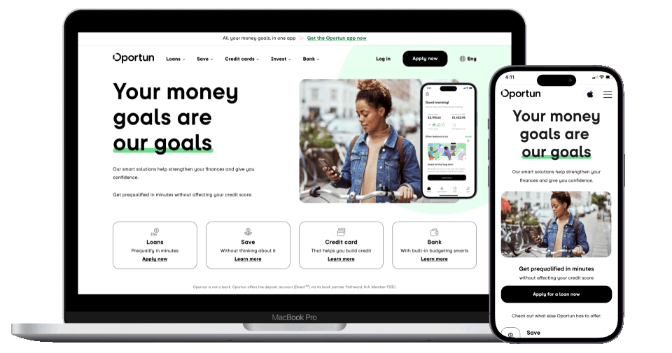
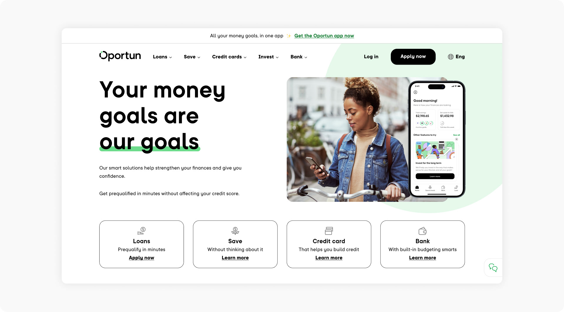
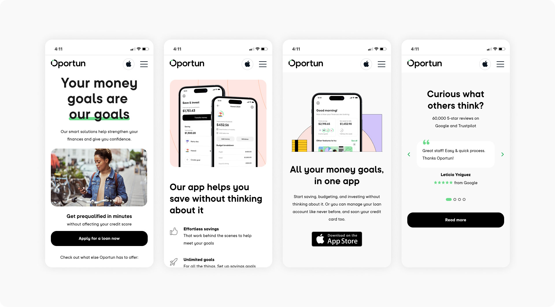
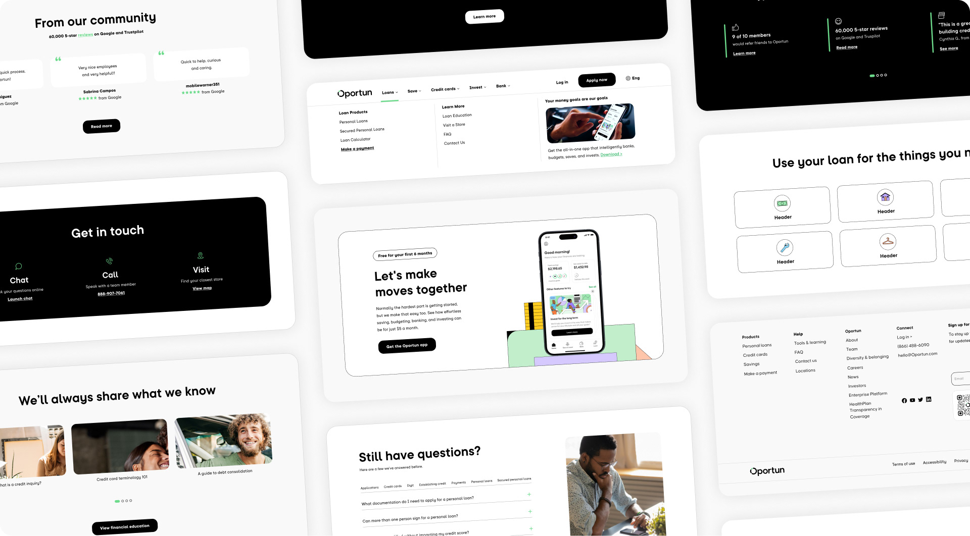
In addition to leading the rebranding efforts, I also led the overall strategy and design of all web properties for both Digit + Oportun. Following a comprehensive audit of the existing web properties, the decision was made to rebuild them for optimal efficiency and performance. To ensure seamless integration across desktop and mobile platforms, I implemented a templated and flexible modular component system that spanned over 50 pages, including home, product, and landing pages in both English and Spanish languages. To ensure optimal user experience, I initiated a testing plan and created alternate designs for hero creatives, home page tab structure, and navigation layout.